Time Frame
12 Weeks
Tools
Figma
Principle
Framer
Framer
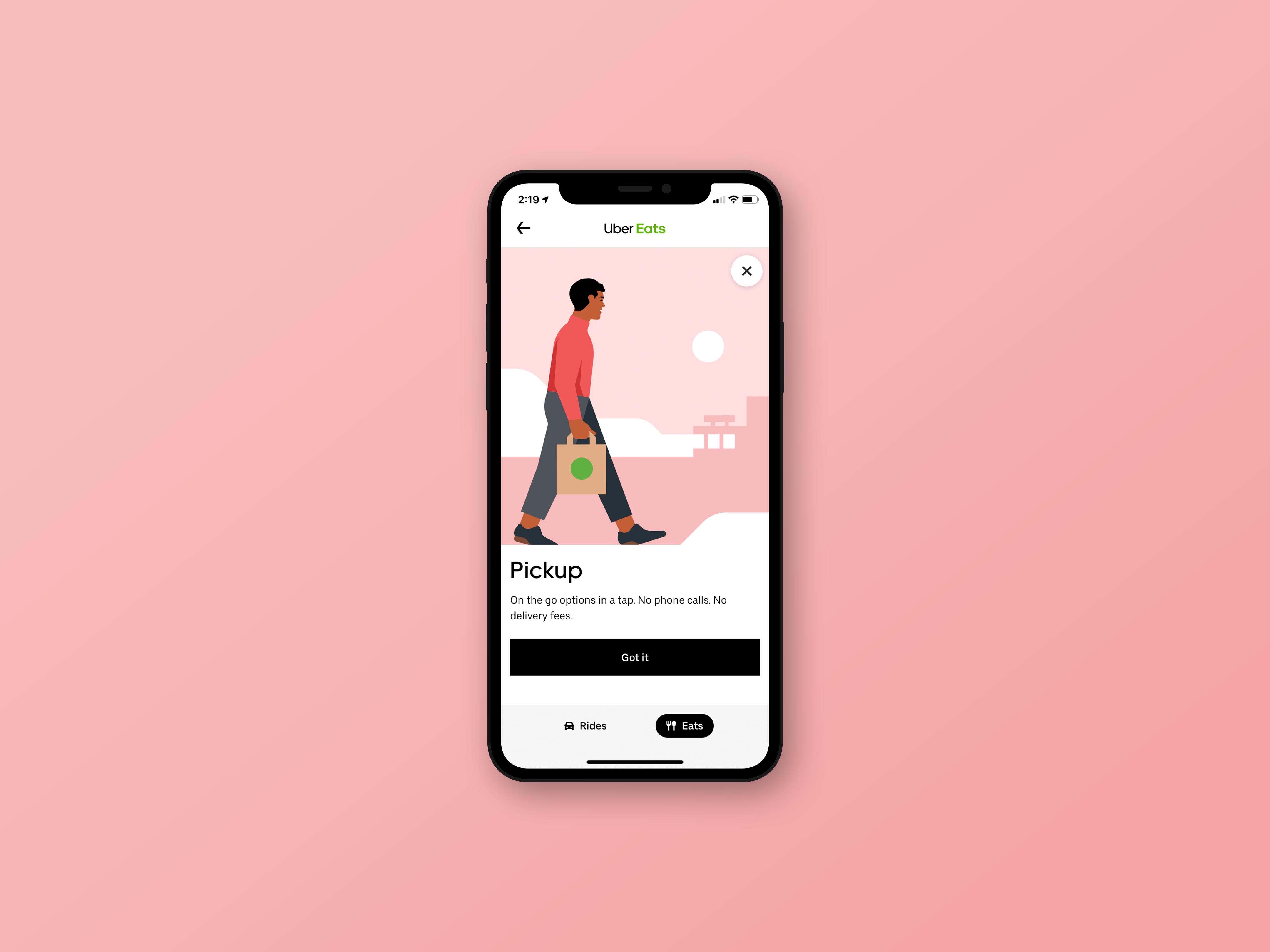
Expanding new Eats offerings beyond delivery.
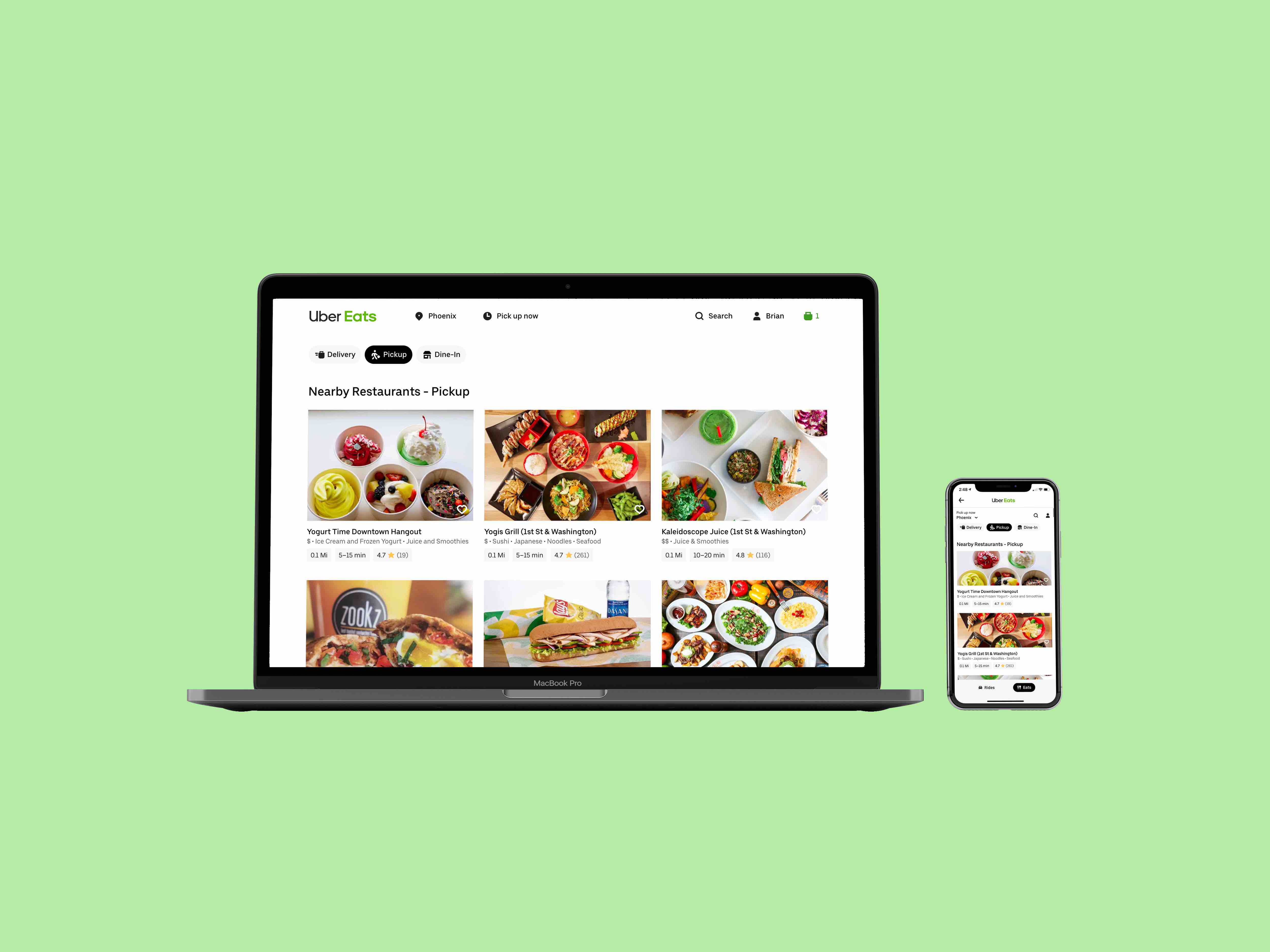
The project has been released! Pickup is now available nationwide in the US and in international cities like London, Sydney and Mexico City. Go on the Uber Eats website to try it out and make an order!
Overview
As a product design intern on the Eater side, I worked with the Web and Growth team to design a new pickup and dine-in feature to create new product offerings on the service.
My Impact
– Designed an end-to-end feature for new dining modalities on the Eats website which touched every core aspect of the Eater journey.
– Created the framework for a new referral model to increase top-of-funnel Eater growth, while proposing a new gamification model that encouraged social sharing.
– Worked closely with engineers through pair programming/designing to analyze code and ensure production model matched my designs after handoff.
– Co-wrote the project requirements document (PRD) with PM to scope out the project while designing a sustainable model for future growth.
– Co-wrote the copy documentation with the UX Writer, improving upon the existing MVP and ensuring that the copy was on-brand and clear to the user.
– Assisted the Localization Program Manager in ensuring feature would be accessible and understandable in 10+ languages.
– Had weekly design reviews with Product Designers, PM's, engineers, and key stakeholders, and gave regular feedback to other designers at design critiques.
– Presented my project to Uber Design Leadership at the end of the summer for buy-in.
Summer Takeaways
Coming into the summer, I wanted to...
1: Gain design ownership of a feature end-to-end.
2: Learn from other parts of the Eats organization.
Takeaway 1: I got better at learning how to design for a system.
Initially, learning all Uber’s design standards and web components (also figuring out the lingo) was a bit overwhelming. Thinking about the “waterfall” effect and how changing one action or function can affect the rest of the flow is an aspect I started to pick up on and helped me make navigate the design process. Instead of thinking about my designs as existing in isolation, I had to consider how it would function at scale, which was a challenging but super exciting problem to solve.
Takeaway 2: The design process doesn’t just start and end with design.
Going through checkpoint meetings and design reviews, having input from PM’s, engineers, marketing, is so crucial to making sure that my designs didn’t just stay in a bubble. Throughout the summer, I had the chance to work with my PM on the PRD and the team UX Writer on the copy doc, which incredibly helpful in thinking about the wholistic design.
Takeaway 3: Go wide before going deep.
Early on in my project, I was so fixated on finding one "correct" solution that I developed a microscopic, myopic view which didn't allow me to consider other possible, potentially unexpected solutions. I felt like I was stuck early on an approach since I already started getting "into the weeds" and creating pixel-perfect drafts on my computer at stage where I should have been more experimental and free-flowing with my ideas.
It was after meeting with my mentor and telling her my frustration with feeling stuck with the small details that we took a step back to think about the bigger picture about the project as a whole. With that in mind, I revaluated my initial assumptions, drawing out a touchpoint map to see where users can enter the flow from a high level while drafting a multitude of converging solutions. This process helped me tremendously in my next referral project, which explored more "blue sky thinking" without initial technical limitations.